3 Must-Try Color Schemes For A Bold And Beautiful Home
- Veronica Solomon
- Dec 27, 2018
- 4 min read
Color is a very important part of designing your home, and setting the mood in your space. I am a big believer that your home should reflect your personality, and color is a definite way to do that.

Most people take the safer route when it comes to choosing a color scheme for their home. In some cases they love and admire bold and beautiful color but don't understand how to use it so their home still looks sophisticated and not hodge-podgey. If you are like me, and bold color is your jam, I recommend that you go for it.
There are ways to accomplish a bold and beautiful look without fear of a clown house.

1 - The Neutral Base With A Pop Of Color
This is a slightly safer route but it is a win for my color phobes. Starting with a neutral base of whites, or warm and cool neutrals is less of a commitment. The larger and bigger ticket items remain neutral and can be used in other settings if you become weary of too much color. Color can then be added through accents and accessories.
Here in this white guest bedroom, we kept the semi-sheer curtain panels, upholstered daybed, and walls white, and layered in color and pattern mix through pillows, area rug and accessories.
This room is fitting for someone who loves bold color, as well as someone who might get tired off too much color.


2 - The "Softened" Trend
I call the color schemes in the preceding two images softened trend. Blush has been quite the trend for the last few years, and when it comes to trends, they fade in and out of style in a heartbeat. Some trends have the ability to stick around for a while and still work even when everyone else has moved on, but it must be done in such a way that it is not the only thing holding the room together.
In the powder room, all the surfaces around the blush color on the walls are timeless and classic, so the blush has a bit more staying power. And if it gets to be too much after a while, the powder room is such a small room that it can easily be painted out in white or some other neutral
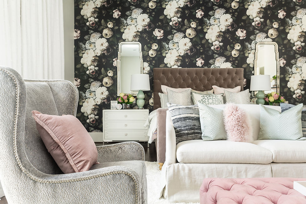
The bedroom scene has a gorgeous wallpaper with shades of blush. I think even when that trend is gone, this wallpaper will still look fresh and calming in this space.


3 - Anything Goes
This is my all time favorite color scheme for a home. It is literally anything goes. I find this to be true for myself when I decorate my own home, and for some clients as well - we typically buy the things we love, and because we do, they usually go together well because they often have things in common. Now this can be a slippery slope if you don't have an eye for design, but I find that sometimes things that seemingly don't belong together can work beautifully together in an authentic space.
In the maximalist living rooms above, it is really anything goes. If you look closely, there are several collections going on at the same time in the one with the gallery wall. Several patterns and several colors. Yet there is harmony and balance in the room. In the first living room all the pattern and color is anchored by textures, and the room feels very sophisticated and lux even though there is a lot going on. Your eye moves around the room easily, and stops on various points of interest. There is a strong focal point in the art piece on the grasscloth wall, and the tiger stripe sofa almost fades beautifully into the background in its supporting role


One more for good measure :-)
4 - Structured
In the preceding two rooms, you cannot deny that there are bold colors going on. Yet the rooms feel very structured and not busy. This is because the same two or three main colors were repeated throughout the entire spaces. On first glance you will notice just the black wallpaper, off-white and dusty pink accents in the first image, but if you look closely, there are quite a few more colors going on that don't immediately jump out at you
Same for the dining room - the citron, teal and black are repeated a lot, and the several other colors stayed more quiet in the room. This creates a more structured look that more color phobes can live with

Have no fear when it comes to color! Good design is good design, and a great designer can make any color scheme work great for a bold and beautiful home.
I added this monochromatic space to show the bold pop of navy. You can see it peeking through on that ginger jar on the cocktail ottoman, as well as in the pillows. It is proof that every room works with an unexpected pop of color
If you are color challenged, we have lots of resources to help you get over it, including my 12 picks for color of the year 2019. Or you can simply call us in for a color consultation. We are happy to help!
Join in on the Lux Living Lounge Community forum, and let us know about your favorite color schemes. Share a picture or two if you like.


Comments